
Our Brand & Visual Guidelines
Artspace Southern Illinois is a nonprofit organization focused on two main priorities: supporting independent creatives and working to bring the cultural arts to more people across Southern Illinois. We serve our region in many ways, including providing grant funding, hosting exhibitions in our dedicated venues, offering free cultural arts events, funding murals and public art, and providing direct support, funding, and services to creatives.
To ensure our message is clear and consistent, we have developed branding and visual guidelines and branding materials, including:
Our logos
Color palette
Typography (fonts)
And more
These elements are part of our identity and designed to reflect our organizational values and connect with our audiences. The following guidelines provide usage standards for our logo, brand colors, fonts, and more.
See Guidelines Below
These guidelines provide clear and comprehensive instructions on how to correctly use our logo and brand elements across various platforms and materials
Logo specifications
Color palette, including primary, secondary, and accent colors, and how to use them with our logo
Typography (fonts) to be used in association with organizational messages
Naming standards for our organization and venues
Please adhere to these guidelines to help ensure our brand identity remains consistent, recognizable, and that our message is communicated clearly. When using our logo, color palette, and elements, please ensure compliance with how to display the colors in association with our logo, as well as using appropriate fonts when related to the organization.
Please NOTE: by downloading or receiving logos for use by the organization and/or brand guideline materials, you agree to adhere to the appropriate branding guidelines and use, and naming standards for Artspace Southern Illinois. Further, to abide by appropriate copyrights and/or trademarks.
If you have any questions, need to submit materials for review, or need assistance, please contact us at connect@artspacesouthernillinois.org
Organization Naming & Terms Information
-
Artspace Southern Illinois
Use full organization in all instances
Organization name should not be shortened (e.g. not Artspace - no longer Artspace 304}
-
Common Terms
Cultural Arts = use this term when referring to the organization’s work as part of the broader creative community and types we serve.
Creative & Artist: Because we serve a variety of creative disciplines, Creative is the inclusive term for the various creative forms (painting, sculpture, creative writing, photography, theatre, etc.). Artist = can be used for methods such as music, painting, fine art, and similar.
Organization Venue Proper Naming
-
Artspace Southern Illinois—On the Strip
Include the full organization name in the venue name and title (Do Not use On the Strip alone or 607 alone.)
Features: Exhibit Gallery, Gift Gallery, Coffee & Tea Cafe
Address: 607 S. Illinois Ave., Carbondale, IL 62901
-
304 Cultural Arts Center
Use with Artspace Southern Illinois Logo or full organization name
Ensure proper use of org logo (do not create a “logo” lockup with venue name.)
Address: 304 W. Walnut Street, Carbondale, IL 62901
-
Corridor Gallery
Use name alone or as the Carbondale Civic Center—Corridor Gallery
This is not an Artspace Southern Illinois venue, but a public space. The organization works collaboratively on exhibitions in this space.
-
Neil & Mary Ellen Dillard Media & Performance Gallery
Use full venue name (no abbreviations).
Use Artspace Southern Illinois Logo or organization’s full name (depending on application).
Ensure proper use of org logo (do not create a “logo” lockup with venue name.)
Address: 304 W. Walnut Street, Carbondale, IL 62901
Our Brand Colors—Use at 100%
-

Primary Color: Black (White on Black | Black on White)
-

Secondary Color: Magenta
-

Accent Only (Not a Background or Logo Color): Soft Yellow
-

Accent & Background Only (Not a Logo Color): Light Gray
Our Logo & Use: Primary Logo Colors and On Brand Colors
-

Primary: Black logo on White
-

Primary: White Logo On Black
-

Logo + Brand Colors: White on Magenta
-

Logo + Brand Color: Black on Gray
Logo Use: Clear Area & Partner Logos
-

Logo Safe Space—Clear Area
Safe space area = a square the size of the org name lockup height space all around logo
-

Logo Safe Space—Clear Area
Print Dimensions: Minimum width = 2 inches
Print 300 dpi
Digital: Minimum width = 150 pixels
Digital 72dpi
Aspect ratio 4:1
-

Our Organization Primary
When Artspace Southern Illinois is the primary organization (or for an org-led activity with supporting partners, exhibitors, or sponsors). Artspace Southern Illinois’ logo should appear larger in size and weight than the secondary logo(s) and maintain the “clear area”.
Black and White should always be the dominant color (or section color)
-

Our Organization is Equal Partner
When Artspace Southern Illinois an equal partner organization, our logo should appear equal in size and weight than the other logo(s) and maintain the “clear area”.
Black and White should always be the dominant color (or section color)
Logo Placement + Examples
-

Do Not Center Logo or Use as Name
Do not center the logo on documents or layout on a page, poster, etc. (exception if on a logo-only sign or banner).
Do not use the logo as the organization’s name. Instead, use the logo as an element but write out the name and/or event/activity in text. See Examples for placement here.
-

Logo Placement Horizontal or Square
-

Logo Placement Vertical
-
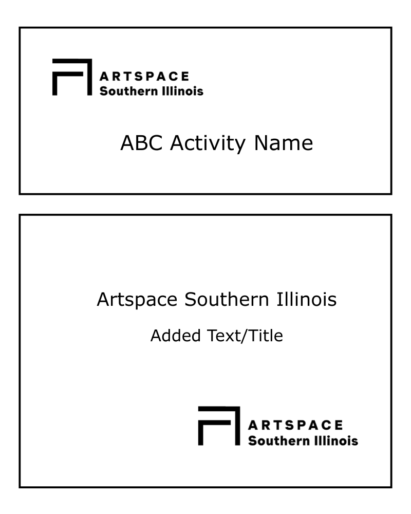
Logo Placement with Name
Use Logo as Provided, Do Not Alter
DO NOT alter the logo, change the color or layout. DO NOT use logo in ways that obstruct or interfere with logo.
See Visual Examples Below
DO NOT use in ways such as:
Distort the logo or change proportions
Rotate or angle logo
Use special effects like drop shadows
Change the logo or element color
Use tint or opacity
Isolate the logo in a box or shape “frame”
Use logo elements or marks separately, such as the “a” mark or word mark (name) should not be used solo or any combination other than horizontal lockup
Use logo word mark or graphic elements in any other applications
Change logo layout to vertical or change lockup
Create new “logos” or “lockups” using activity, event, ect. name in text placed close to logo (violating safe space)
Use over a busy background, making it hard to see or read the logo
Use over illustrations
Use the wrong color version that does not stand out over a light or dark background, making it hard to see or read the logo
Place other elements or logos in “safe” space (see size/space guidelines) that crowds logo making it difficult to read or see
Use smaller than the minimum size guidelines making it hard to read

Branding Typography (Font Use)
